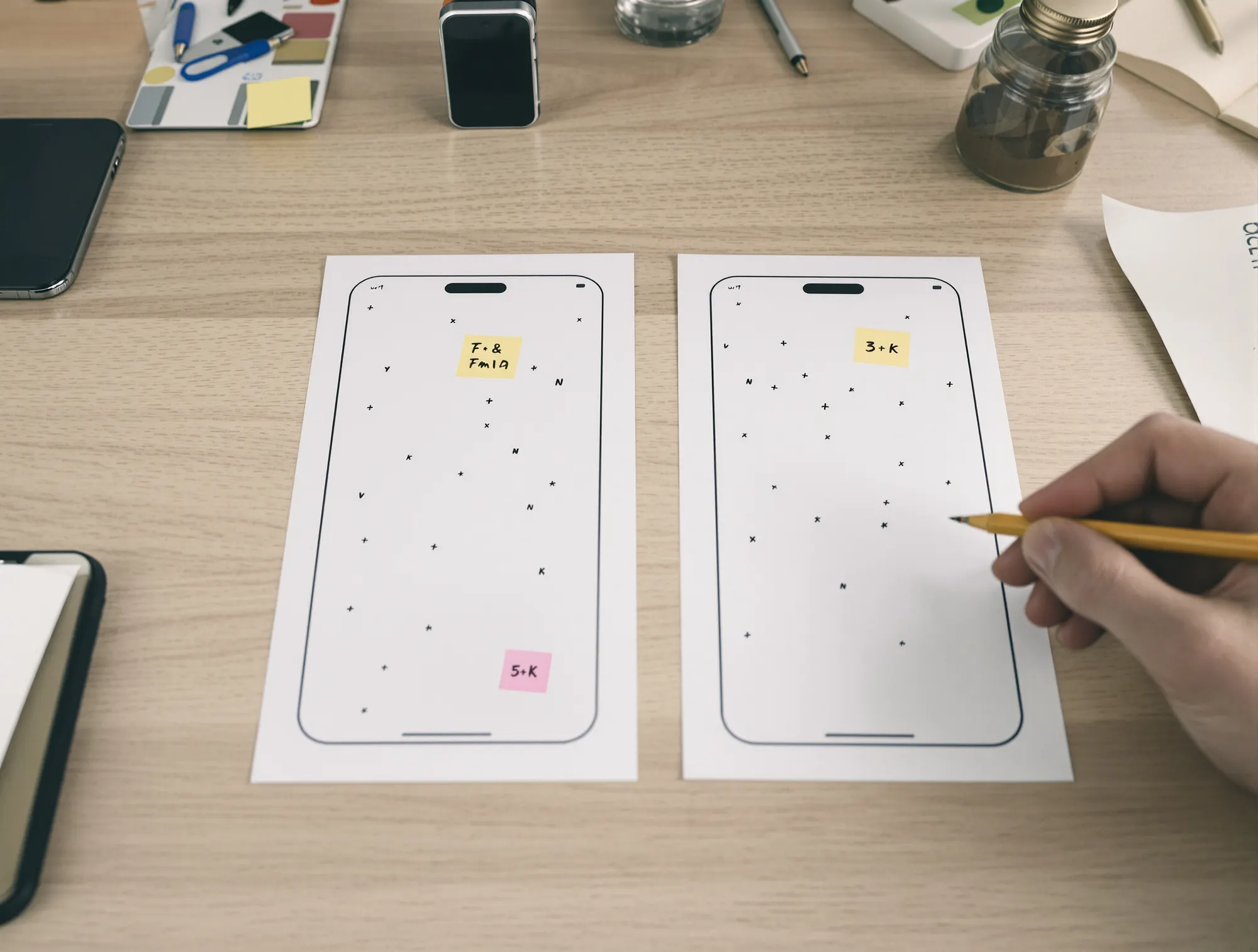
Over 60 percent of all web traffic now comes from mobile devices globally (Statista, "Mobile Internet Traffic Share," 2025), and Google has completed the transition to mobile-first indexing — meaning Google evaluates the mobile version of your site as the primary version for ranking. Designing for mobile first is no longer a progressive approach, it is the baseline requirement. This guide gives you concrete design principles and practical techniques for mobile-first web design.
Why mobile-first is the standard approach
Mobile-first means designing for the smallest screen first, then scaling up to tablet and desktop. This approach forces you to prioritize content and functionality — what is not important enough for the mobile screen is probably not important enough for desktop either. The result is cleaner design, faster pages, and better user experiences across all devices.
Google confirmed in 2023 that mobile-first indexing now applies to all websites — there is no desktop-first index anymore (Google Search Central, "Mobile-First Indexing Best Practices"). Content only visible on desktop will not be indexed. Functionality that only works on desktop provides no SEO value. This alone makes mobile-first a business-critical design decision.
For the connection between design and conversion, see our UX design guide.
Mobile-first vs. responsive vs. adaptive design
The terms are often used interchangeably but mean different things. Mobile-first is a design philosophy — start with mobile, build up. Responsive design is a technical implementation — one set of HTML/CSS that adapts to screen size via media queries. Adaptive design serves different layouts for different screen sizes, often with separate templates.
In practice, mobile-first responsive design is the preferred approach in 2026. You design mobile first in Figma, build with CSS that defaults to mobile (min-width media queries to add desktop styles), and use flexible layouts with CSS Grid and Flexbox. Adaptive design with separate mobile sites (m.example.com) is outdated and discouraged by Google.
The technical implementation starts with CSS: write base styles for mobile, then use @media (min-width: 768px) for tablet and @media (min-width: 1024px) for desktop. This approach — "progressive enhancement" — ensures the mobile experience always works, while desktop styles are added as a bonus.
Designing for touch: Target sizes, spacing, and gestures
Fingers are imprecise compared to mouse cursors. Apple's Human Interface Guidelines recommend minimum 44x44 points for touchable elements. Google's Material Design specifies 48x48dp. WCAG 2.2 requires minimum 24x24 CSS pixels. In practice, aim for 44-48px for all clickable elements — buttons, links, icons, and navigation items.
Equally important as size is the spacing between touchable elements. Elements placed too close together lead to mis-taps that frustrate users. Minimum 8px between clickable elements, ideally 12-16px. Pay special attention to navigation menus, lists of links, and form fields on mobile.
Gestures beyond tap — swipe, pinch, long press — can enhance the mobile experience but should never be the only way to perform an action. Not all users know about gestures, and they are invisible without instruction. Always provide a visible alternative interaction.
Mobile navigation: Hamburger, bottom nav, and tabs
The hamburger menu (three lines) is the most widely used mobile navigation pattern, but also the most controversial. Studies show the hamburger menu reduces discoverability — users explore fewer pages because navigation is hidden (NNGroup, "Hamburger Menus and Hidden Navigation"). For sites with few main sections (4-5), consider showing navigation directly in a horizontal scrollbar.
Bottom navigation — a fixed menu at the bottom of the screen — has become standard in apps and is increasingly common on websites. The advantage is that elements are within thumb reach (see thumb zone design). The limitation is space — maximum 4-5 elements.
Tab-based navigation works well for content that naturally divides into categories — for example product categories, filter options, or content sections. Tabs should scroll horizontally if there are more than what is visible, with a visual indicator signaling more content. For more on web design and conversion, see our web design and CRO guide.
Mobile typography and forms
Text that is readable on desktop can be illegible on mobile. Minimum body text size for mobile is 16px — this is also the minimum to prevent iOS Safari from automatically zooming into input fields. Ideal body text size is 16-18px with a line-height of 1.5-1.6 for optimal readability on small screens.
Headings should scale down on mobile. Use CSS clamp() for fluid typography: font-size: clamp(1.75rem, 4vw, 3rem) gives an h1 that scales smoothly between mobile and desktop without hard breakpoints. Text blocks should be narrower on mobile for optimal readability — 45-75 characters per line is ideal (Robert Bringhurst, "The Elements of Typographic Style").
Forms are the biggest friction point on mobile. Use HTML input types consistently: type="email" provides a keyboard with @ symbol, type="tel" provides a number pad, inputmode="numeric" provides a pure number keyboard. Autocomplete attributes are even more important on mobile than desktop. Date pickers should use native HTML date input on mobile rather than JavaScript datepickers.
Mobile images and media
Images are typically the heaviest resource on mobile websites. Use srcset and sizes attributes to serve the correct image size to the device: a mobile user does not need a 2400px wide image. Modern formats like WebP and AVIF provide 25-50 percent smaller file sizes than JPEG at comparable quality.
Always set width and height (or aspect-ratio in CSS) on images to prevent layout shift — the visual "jump" that occurs when images load and push content downward. Layout shift is a Core Web Vital (CLS) that directly affects SEO ranking.
Lazy loading with the loading="lazy" HTML attribute is now supported in all modern browsers. Set it on all images not visible in the viewport at page load. The first visible image (hero, product image) should have loading="eager" and fetchpriority="high" to load fastest. See our performance guide for more optimization techniques.
Mobile performance: Critical rendering path and 3G budgets
Mobile users often have slower and less stable networks than desktop users. Google recommends that Largest Contentful Paint (LCP) should be under 2.5 seconds. On slow mobile networks, this requires aggressive optimization of the critical rendering path.
A performance budget for mobile should target: total page size under 1.5 MB, JavaScript under 300 KB (compressed), critical CSS inline in HTML, and Time to Interactive under 5 seconds on a mid-range phone with 3G connection. These numbers seem tight but are necessary for a good mobile experience.
Third-party scripts — analytics, chat widgets, ad platforms, A/B testing tools — are the most common cause of slow mobile performance. Audit all third-party scripts and load them asynchronously or with the facade pattern. For a complete performance guide, see our Core Web Vitals guide.
Thumb zone design: Reachability and placement
Thumb zone research by Steven Hoober showed that 75 percent of mobile users use their thumb to interact with the screen ("How Do Users Really Hold Mobile Devices?", UXmatters). The "natural" zone — where the thumb easily reaches — is the lower half of the screen and the middle section. The upper and lower corners are hardest to reach.
Implications for design: Place primary interactions (CTA buttons, navigation, common actions) in the lower half of the screen. Secondary actions (search, settings, filtering) can be placed higher. Avoid important interactions in upper corners.
For long pages: use a fixed bottom bar with the most important action — "Add to cart," "Order now," "Contact us." The button is always within thumb reach regardless of scroll position.
Testing on real devices
Chrome DevTools device emulation is useful for rapid development but does not replace testing on real devices. Emulation simulates screen size and user agent but does not capture touch feel, performance differences, browser-specific bugs, or network conditions. Always test on at least one iPhone (Safari) and one Android device (Chrome).
BrowserStack and Sauce Labs offer access to hundreds of real devices in the cloud. For local testing, Android Chrome Remote Debugging and Safari Web Inspector for iOS are invaluable — you can inspect elements, see console messages, and debug directly on the phone.
At LeapJet, we always test on real devices as part of the QA process. We use BrowserStack for breadth testing across devices and OS versions, supplementing with an internal device library of the most popular models. See our glossary for definitions of responsive design, PWA, mobile-first, and UX.
Progressive Web App (PWA): When it is worth it
Progressive Web Apps combine the accessibility of websites with app-like features: offline support, push notifications, home screen installability, and faster loading via service workers. For some use cases — e-commerce stores with repeat visits, tool websites, news media — PWA can deliver measurable improvement in engagement and conversion.
Alibaba reported a 76 percent increase in conversions after PWA implementation, and Starbucks' PWA is 99.84 percent smaller than the iOS app while still delivering offline ordering (Google Developers, "Progressive Web App Case Studies").
Consider PWA if: your users visit frequently (daily/weekly), you need offline functionality, push notifications are relevant for your business model, or you want to avoid the costs of native app development. For web design and mobile optimization services, see our web design services page.